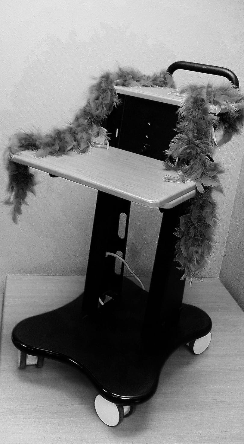
Admittedly, “sexy” is not an adjective one would generally apply to medical carts. They are meant to serve a specific purpose to the medical field, so why should aesthetics matter? Consider this: what would you do if you walked into the doctor’s office and saw a medical cart that looked like it rolled out of 1995, all sharp corners and boxy? You’d probably lose confidence or respect for that medical establishment.
The physical aesthetic of a medical cart conveys a customer’s stories, competence and demeanor, so it’s not surprising that they request a sexy medical cart that resembles the latest technological gadget. According to industrial designer Julia Behm, designing such a medical cart boils down to simplicity.
“I generally start my projects with what I call my discovery phase. I establish exactly what the customer wants, and that means understanding them and knowing how their equipment functions,” explains Julia. In some cases, she will observe a customer’s current medical carts in action. She takes note of size, uses and improvements to be made. Likewise, she observes the cart’s organization. This may seem like a trivial detail, but organization is the critical difference between a blocky, barely passable medical cart and a sleek, fully functioning medical cart.
The next step revolves around understanding your customers’ goals. We want to convey a sense of empathy with our customers, establishing a “we’ve walked in your shoes” connection. Julia alludes to her experience with motherhood as an example: “As a mother of three, I know a lot about strollers. And I can tell you, if a stroller doesn’t have a cup holder, I will not be buying it.” Something as simple as a cup holder can convey a sense of understanding and empathy. Similarly, medical carts should accommodate medical staff and anyone else affected by them.
When designing a medical cart, functionality always trumps aesthetics. However, after organization and pragmatic decisions are made, designers are at liberty to implement an artistic flare that embodies the customer’s existing themes, colors and styles. Attention to details like materials, line patterns, paints, curves and round edges also enhance the aesthetics of your medical cart, but before deciding what to use, consider how the cart is cleaned. Certain paints can either alleviate or exacerbate this process.
To learn more about our concept stage process or the relationship between paint appearance and cleaning, check out our past blogs: Achieving Faster Speed to Successful Medical Cart Concept and Will the Paint & Appearance of my Medical Cart Hold Up to Cleaners?.

